Exit Mask: A Postmortem
There is no elevator pitch for Exit Mask.
That’s not so much a futile attempt at making the game out to be some conception that is beyond standard description, in fact it’s pretty straightforward. It’s a psychological horror game light on the mechanics side, fitting the criteria of a “walking sim”, with linear objective based gameplay through abstract labyrinth-like scenes to the tune of noise and ambient music, with the USP of course being the minimalistic visuals rendering every surface pitch black with its edges in stark white. Makes sense.
Rather, the statement refers to my own perception of the project. Despite spending numerous hours on it daily for 6 ½ months, whether it was poring over broken C# files, haphazardly sketching level layouts on grid paper or obsessively analyzing every frame of animation, not once was I ever entirely sure what I was trying to do with Exit Mask. Now that development has been completed, I’m not too sure what to make of it in its finished form either.

Obviously it was meant to scare, as most horror games do, and it aimed to employ an art style that would help build upon its atmosphere. These aspects were clear from the start, and I consciously put a lot of effort into their implementation throughout Exit Mask’s development. Besides that, not much else is as concrete. Did it tell a story? No, not really. Perhaps you could say there’s progression in the game’s locations and events, but nothing resembling a plot. Was there a deeper meaning to it all? Again, not really. Though it comes with what appears to be very heavy implications, Exit Mask doesn’t try to make a statement about anything. The inspiration for this game stemmed from a rather unpleasant past experience involving endless intrusive thoughts, with the now overcome ordeal eventually manifesting itself into the game in many forms. At the time though, I struggled to conjure a way to translate those ideas into something playable, and more importantly, engaging. Making a thought provoking and/or enlightening game focusing on mental health appeared to be a lofty task, and not one I personally found would be fulfilling, so instead I opted for a more raw and abrasive take on my experience. A game where the player is constantly bombarded with graphic imagery that clouds the player’s vision the harder the try to squirm away from their problems, emphasizing the depravity of both the player’s thoughts and the coil they’ve found themselves in.
For the player, this didn’t leave much for them to take away from Exit Mask, other then maybe a sense of pure discomfort or disgust. Was the game just glorified shock value? Maybe an artistic outlet that would resonate with others? Not sure, but ultimately, I decided my only goal was to merely make players feel something. Wasn’t much to go by, but I rolled with it nonetheless.
Development on Exit Mask started in late June 2019, beginning with prototyping the player’s controller scripts and getting the game’s edge detection shader to meet the standard I had envisioned. Following that were enemy designs, level grayblocking, AI scripts, animations and lastly music/sound effects. This would be worked on throughout the Summer of 2019, culminating in a complete build of the game’s first chapter, “Sutures”, released on itch.io in mid-September as a demo.
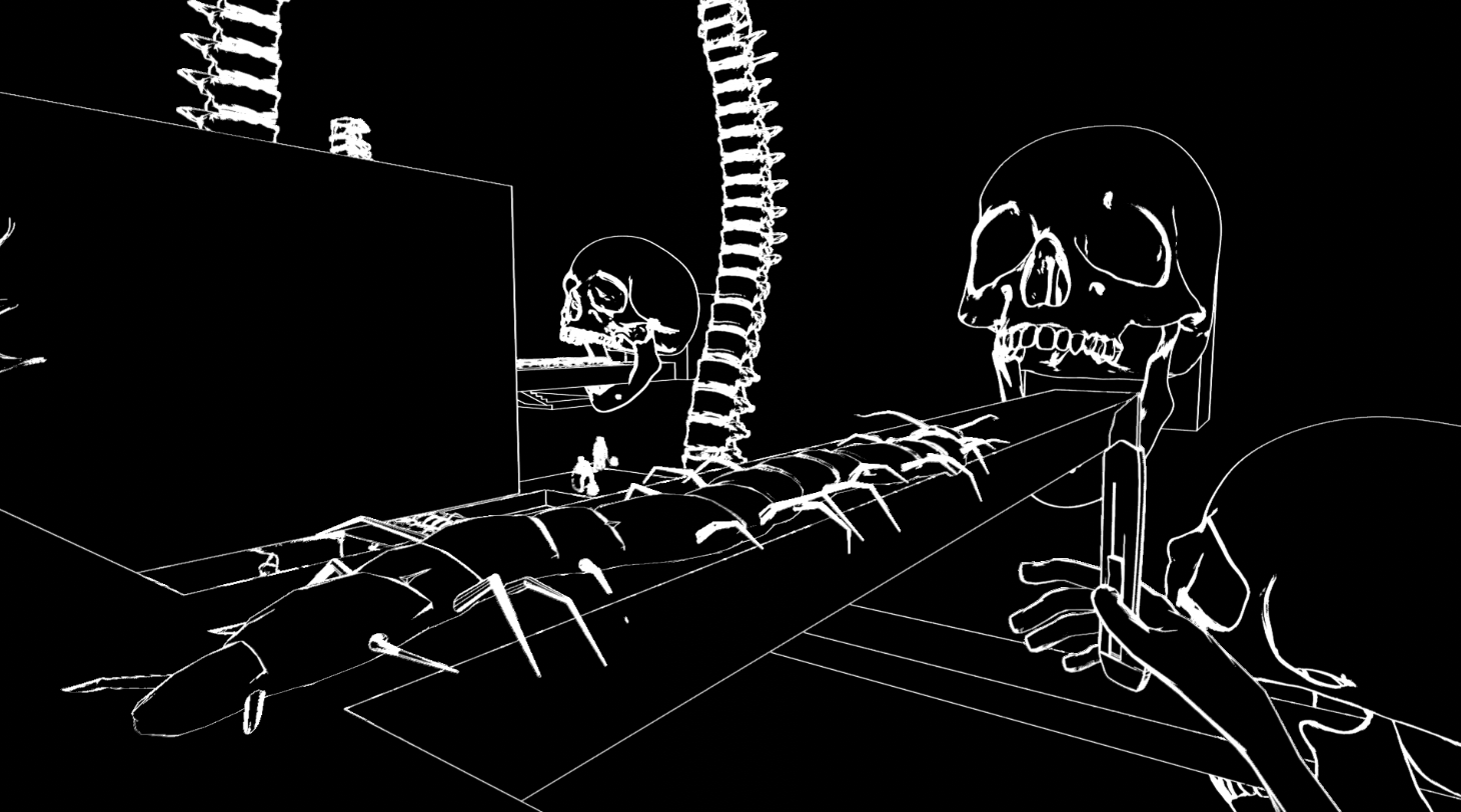
Reception for the most part was positive, averaging about 40 downloads a day for the first 3 or so days, a number I was quite content with given that the game had next to no presence online at that point. Sometime during those first few days, the game got picked up by gaming website Alpha Beta Gamer, who wrote an article about it and featured it on their YouTube channel, exposing Exit Mask to a newfound audience. A few weeks later, horror content creator Billy Styler uploaded a short video essay titled “What is Exit Mask?”, theorizing its themes and symbols whilst attempting to answer the question: “what on Earth is up with this game?”. That video would end up racking over 140,000 views, and much like ABG brought Exit Mask forth to a much larger player base than I could have hoped for. Many other users would go on to create videos of Exit Mask, whether through let’s plays or theorycrafting, and they’re all much appreciated.
After a well deserved break following the release of “Sutures”, I returned to work, this time to start and finish the second and third chapters, “Sepsis” and “Scabs”. New enemies, level mechanics, music and sound effects were gradually added over the course of October until mid-December. During that period I finally got around to making a Twitter account, where I began posting weekly updates on the project to spread the word and interact with fellow indie devs, an overall great experience so far might I add. Sharing progress on the project every Saturday through #screenshotsaturday was something I always looked forward to, and the positive feedback from initial and new fans was helpful in getting me through the rougher patches of development.
Exit Mask was unleashed to the public on January 3, 2020. With a few weeks passed, and the game having made its rounds on YouTube and itch once again, I decided to compile my thoughts on the experience developing my first game, with what succeeded and what failed. Though I'm mainly doing this for myself, as I've always viewed postmortems as fulfilling send-offs to a project you've labored over, I also saw this as an opportunity to offer insight to players interested in a game that's been rather elusive for the most part.
What went wrong?
The "Non-Game" Elements
I wanted to end this postmortem off on a high note so I figured I'd get the less-than-glamorous aspects of Exit Mask's development out of the way first.
When it came to the core aspects of Exit Mask (assets, level design, scripts, minor polish) I did a decent job for the most part. The game obviously runs, can be completed, and any game-breaking bugs (of which there’s only 2 or 3… I think) only impede the player’s progress by so much before they can reload their save. It was a solid effort overall. Outside of that, conversely, my attempts at programming accessibility and player settings were a complete failure.

For those who read the Post-Demo Update I posted back in mid-September, you might remember a mention of several QoL changes I had hoped to implement. For the sake of scope I limited myself to adding in mouse sensitivity, music volume and SFX volume, and though not explicitly announced I toyed with the idea of a windowed mode toggle. Unfortunately, none of those features made it to release, with the exception of a mute option awkwardly shoved into the pause menu. Being that all those options are standard features in practically every playable game nowadays, I wrongfully assumed that the procedure to implement said features would be streamlined and painless to add. For all I know, they probably were, but if that were the case I definitely screwed up researching and learning how to do so.
Despite being announced back in September, work on these features only began once the game started wrapping up in early December. By then, all my systems had been put into place (such as my audio manager for example, which stored all sound effects and played them when needed), so any changes to these classes to accommodate for Unity’s built-in functionality (in this specific case an audio mixer) would have required major code restructuring that would involve far more effort than what I presumed to be worth. This was yet another instance of a severe lack in research that involved taking the effort needed to program options for granted. Though they may look easy given how commonplace they are, it's still vital that one actually understands what these implementations demand and how they can shift the design of your game’s infrastructure. If dismissed for long enough, they can become much more difficult than what you bargained for.
Optimization
Piggybacking off of that, it appears I also suck at optimizing Unity projects. Much like the options, I left optimization until the end thinking it was a few simple procedures done to cap off your game rather than something you consistently try to maintain. On top of this, I naively assumed that because Exit Mask wasn’t the most graphically/performance intensive game, I could get by with little to no optimizations at all, even going as far as to indulge in tools viewed as costly by many (mesh colliders, certain function calls every frame, non-retopologized models) with the mindset of “enh, how bad could it be?”.

For laptop users? Pretty bad. Nigh unplayable at certain points. The most egregious instance of poor optimization in the release build was with the Ward and Womb scenes, whose framerate drops resembled a PowerPoint presentation more than a playable game. These drops made manoeuvring through said scenes an absolute chore, and because of lag it wasn’t unlikely players would accidentally phase through colliders leading to unintended deaths. I still don’t know exactly why those two scenes in particular were such a hassle at runtime, which is a problem itself, but the bare minimum optimization I did attempt (occlusion culling, and in the most dire of cases mass deleting level props to reduce draw calls ) wasn’t enough clearly. It’s safe to say optimizing Exit Mask was more damage control than anything else. Backwards implementation, an afterthought, one that unfortunately came back with a vengeance.
Luckily, any user with an actual computer probably had no issues running the game, but it’s still embarrassing nonetheless to see runtime issues plague laptop users. I don’t think playing a short, cheap little indie game without overworking your system is much to ask for (especially as somebody who primarily uses a laptop), and I plan on bringing that to fruition with whatever project I work on next. I’ve learned my lesson: research Unity’s optimization tools extensively, and design my game with them in mind from the start.
Not Playing Enough Games
An extremely crucial yet oft-overlooked practice in developing a game is the act of actually playing games. It makes sense. For most, playing video games isn’t what springs to mind when work is brought up, instead reserved for those coveted pockets of time in which there’s no work to be done. Understandably, people feel obliged to avoid performing self-indulgent activities when there is still much to do.
It’s surprisingly easy to swear off playing games of any sort while developing your project in an effort to stay focused, as they can admittedly be distracting and time-consuming, but what appears to be a responsible compromise can actively be a detriment to your game. Aside from giving yourself a much needed break, which is always important, playing games can be an excellent source of reference for you to use in your own project. Seeing how other developers tackled problems you may face, the conventions users may expect, what to incorporate, what to avoid, whether something has been done before or not. All this information can be used to your benefit to craft a better game, and it’s something I wish I had done more often...or at all.
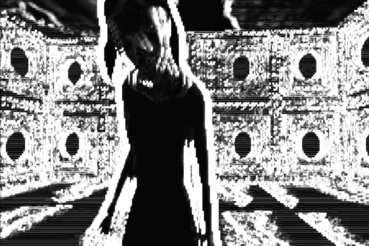
For those unfamiliar, Sad Satan is a horror game with a distinctly grim reputation within online circles, known for its cryptic origins and a dreadful focus on child abuse. Prior to the release of “Sutures”, I had never heard of Sad Satan until users began to draw parallels between it and Exit Mask, with some lightly noting the similarities, while others less elegantly claimed it was simply a copycat. This point of contention stemmed from the method in which unsettling images were displayed to the user in both games. In Exit Mask, looping gifs of various unpleasant sights regularly cloud the player’s vision, representing intrusive thoughts in an attempt to simulate how discomforting and bothersome they can be. Lacking substantial programming knowledge I wasn’t sure how to present these images in a cinematic or “more professional” manner, so instead I opted to just have them appear and disappear at random intervals. It was very unrefined, but at the same time it felt very raw and upfront, so I ended up sticking with it for the rest of development. Sad Satan does something similar. At various points in the game, the player’s screen will be completely obscured by strange photos that prohibit them from progressing until they disappear automatically a few seconds later, with content ranging from child-murderer mugshots to accident victims.
Though the rip-off accusations didn’t hold much weight, as it was in all honesty a coincidence, it revealed how misinformed I was of the type of game-space I was stepping into. Going beyond image similarities, I had no frame of reference for what made good psychological horror tick, simply because I didn’t seek it. Looking back now had I done a bit of research I could have avoided reinventing the wheel, found new inspiration and adopted design choices that would change the game for the better (though, maybe for the worst).
What went right?
Knowing My Limits
While I had worked on a game 8 months prior to starting development, it was in the form of a college capstone project where simulating the course of development from concept to release was the priority, also serving as my ticket to a Game Development diploma. So really, Exit Mask is my first official game.
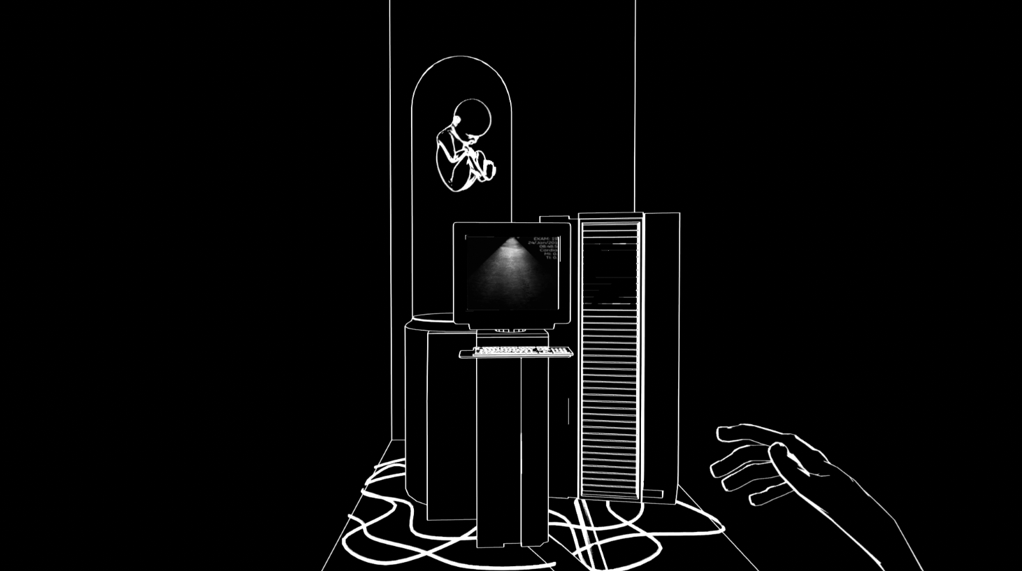
Before development began, I could hardly be considered even a novice programmer. My C++ skills were rusty, and my only exposure to C#, the language I chose to use, were from basic scripting classes I may or may not have skipped in college. Looking for an excuse to strengthen my programming skills, I decided Exit Mask would be my self-taught introduction to scripting, with my understanding of C# hopefully growing as development progressed. A sound commitment, yes, but I had to be realistic knowing that even at best my scripting knowledge wouldn’t even come close to somebody who programs games for a living anytime soon. I had to make sure that all functionality I would implement was simple enough to program for someone at my level, yet still somewhat engaging as a gameplay element, even if carried by the game’s atmosphere.
Much of Exit Mask’s scripts relied on interacting with the numerous components of the scene’s GameObjects, where variables would be altered, functions would be called, or objects would be enabled/disabled. This concept was simple enough to learn and even simpler to write. Otherwise any other events happened as a result of collision, either through collision boxes or trigger boxes. Checks would be made, booleans would be set, animations would be played, objects would be destroyed etc. It was never too difficult to program, while still allowing all of the game’s systems to function in tandem. Was it the most engaging or nuanced gameplay? No, absolutely not. But it conveyed what I intended without ever biting off more than I could chew.

Approaches to the soundtrack were taken with the same amount of caution. Sound design and music production are an entire different realm of game development I hadn’t ever ventured into. Lacking any proper audio editing software or equipment to record music, I resorted to a soundtrack that was easy enough for me to compose that still fit Exit Mask’s atmosphere. Midway through “Sutures”’ development I had been listening to lots of noise music. I was captivated by the volatility of the seemingly arrhythmic walls of sound and how suffocating and oppressive it was to the listener. It was pure disarray caged in a .wav file, and I found it to be a perfect match for the brash, inhospitable setting. On top of this, because noise music is supposed to be, well, noisy, I could do away with the luxuries of credible sound design that made things actually sound good. Effects and tracks could be unpleasant, even painful if I wanted them to be, simply because “that’s how it’s supposed to be”. With this mentality in mind I sampled ambient recordings and slapped several distortion and compression effects to create eerie, glitchy, disruptive sound effects and a small score to back the game. It did wonders for the game’s presentation with little effort, allowing me to provide as much attention needed to the areas I was most confident in.
Code Architecture...Sort Of
Throughout my time in college we were repeatedly instructed on the ways of designing code using various means of documentation, taking cues from the software development industry. Software engineering mainstays such as UML diagrams, pseudocode, behaviour trees, CRC cards and scene graphs were regularly enforced to ensure our games’ codebases were organized, readable and thoughtfully carried out with little to no backwards implementation. I understand their importance now, but back then the idea of planning out a game’s system before even booting up an IDE was something I couldn’t wrap my head around. Here I was, struggling to write functioning code, or even understand what the hell I was trying to write despite the tools at my disposal. Now I had to create those same systems in a more abstract and visually reliant manner? Fat chance. Thankfully, due to my position as team art lead in final year I never had to concern myself with programming documentation. Back then it was surely a relief, but it came at the cost of valuable knowledge I would need in a few months time.
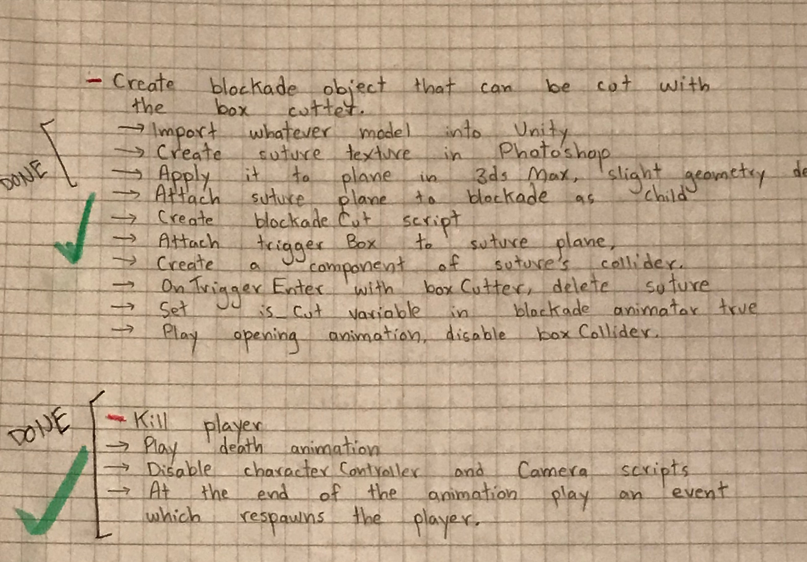
Documentation came into play when most of the Maze’s infrastructure had been put into place. That area would be the first instance of the player encountering something resembling AI, so I began brainstorming how exactly I would program the enemy behaviour. I had been out, away from my workstation, reading up Unity’s documentation regarding NavMeshes when what I was studying suddenly presented me with an idea on how to set up the fumigator’s patrol code. Without access to Visual Studio, I resorted to pulling out my notebook and writing a step-by-step process on how to write a simple patrol script in pseudocode. Well, my version of pseudocode at least, which was a mixture of complete sentences, shorthand and basic function layouts. But still, it had been the first time I made an effort to plan out my code, and it worked surprisingly well! Functionality that appeared too convoluted when trying to assemble it in my head became extremely straightforward the moment I started laying it out on paper.
Afterwards I started writing out any large piece of game logic. That way, any new addition to the game’s codebase was simply a matter of following a simple procedure, avoiding any possibility of spaghetti code. Many features I had reservations about when it came time to implement were made much easier with this methodology, and though it wasn’t nearly as sophisticated as software documentation standards, it put me into a good habit.
Forgoing Structure
Stumbling through development of this game was a double-edged sword. On one hand, piecing a game together bit-by-bit with no clear goal in mind proved difficult. The cushion of having an easy-to-follow template and knowing exactly what to do to achieve exactly what I want was absent most of the time, and in all honestly resulted in much stress and self-doubt. On the other hand, this lack of structure helped Exit Mask blossom into something that was totally its own.
Oftentimes I see horror films/games get heavily criticized for an assortment of things that to me are symptoms of a game being too “choreographed”. By that I mean instances where the game very clearly tries to make you feel a specific way, in this case afraid. Things like jumpscares, scripted events, overarching stories, a big reveal that completely shifts the player’s perception of the game. In a vacuum there’s nothing wrong with those types of elements of course, developers should be able to do whatever they want with their work, but if handled incorrectly they can easily sabotage the momentum a game carefully builds towards. This idea of structured level beats just for the sake of the game feeling more complete or “legitimate” was something I wanted to avoid as much as possible.

Levels are generally amorphous. Aside from the Home scene, which depicts a very clearly defined space, every other level can be summed up as a sparse labyrinth in the middle of pitch black voids peppered with enemies and objectives that exist just...because. There are no transitions between these levels that attempt to explain why you’re there. The plot, if you want to call it that, is revealed in a very indirect manner. There are practically no staged events that drive the player’s progression forward (besides exits opening after the player has completed their objectives), they can roam areas in whichever way they please for the most part. In short, I sort of just let everything play out and hoped it didn’t completely fall apart.
I was aware this type of game flow would be unsatisfying to some, but those who didn’t mind found playing the game to be strangely unique. The pacing was off-kilter, things didn’t make much sense, and there was very little in the way of direction. Not exactly what good games aspire to be, but in the case of something designed to be weird and disorienting it only served to amplify what it already brought forth. It operated by its own rules, and disregarded them just as easily. Is it a design methodology I’d use again? Absolutely not, but in the case of Exit Mask it ended up working out for the most part. Consider me lucky.
The Visuals
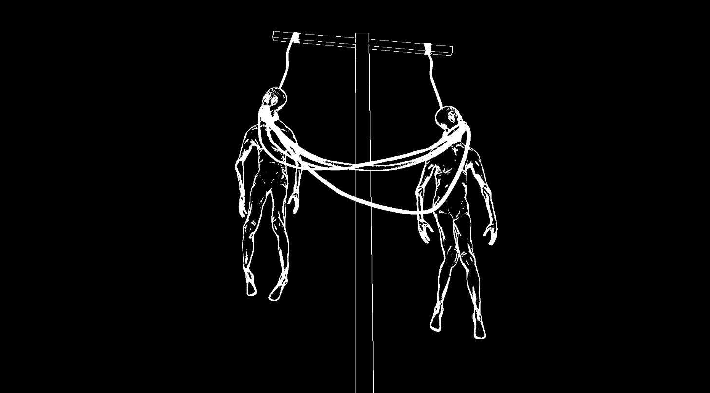
Without a doubt, the most appealing aspect of Exit Mask are its unique visuals. It practically sells itself, and thankfully for me, the rest of the game as well. While players may find something special within the game’s tone, use of scares, sound design or general pacing, only when paired with the game’s striking monochromatic aesthetic do they ever truly shine.
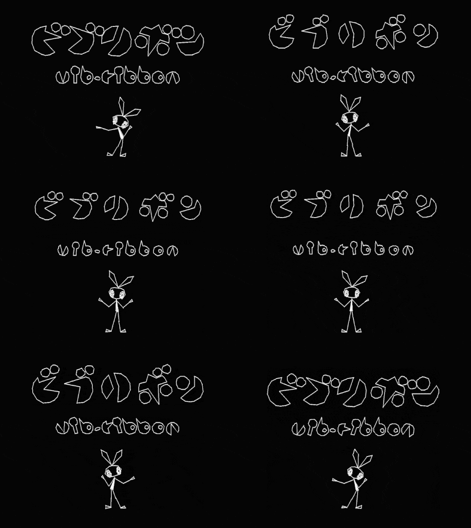
The catalyst for Exit Mask’s art style stemmed from two unlikely sources. The first was vib-ribbon, a cult-classic released for the PlayStation in 1999. An interesting little piece of game tech, vib-ribbon was a rhythm game that allowed players to load any CD into their PlayStation and have a level generated from that CD’s music. Visually, it was much less advanced, sporting angular white vector-based graphics to form simple shapes and characters amidst a pure black background, and it was this peculiar style that served as Exit Mask’s artistic inspiration. Anybody who knows me personally is aware of my affinity for the colour black, and I had been toying with the idea of making a game with predominantly dark visuals for some time. Seeing its usage in vib-ribbon proved just how effectively it could be done.
Before anything else in the game was completed, or even prototyped, I had spent a week attempting to create a shader that would depict all surfaces in a specific colour, with edge normals passing a certain threshold depicted in another. I’m no graphics programmer by any means, so the best I could muster up was a Frankenstein’s monster of code comprised of Unity standard assets, tutorials and computer graphics theory, but I eventually got something out of Unity’s post-processing stack that matched up to what I’d envisioned.
With a slick coat of paint to slather my game world, I required a direction in modelling that would go along with the black and white aesthetics, which is when I turned to my second source of inspiration. Government Plates by experimental rap group Death Grips is an album that instills a sense of digital detachment with its harsh cold instrumentals and heavy use of vocal filters throughout its 35 minute runtime. A strong enough quality to emulate on its own, the album’s spirit is reinforced through its series of stark, lifeless music videos featuring renders looping simple animations on a black background. Everything feels synthetic, hollow, bleak, it’s an essence I wanted to capture for Exit Mask’s setting (or lack thereof). This influenced how sparse levels were, how players interacted with pickups, as well as the game’s iconography, ranging from needles and spinal cords to computers and birds.

Aside from an alluring art style, Exit Mask’s all-black everything did a substantial job at alleviating my one-man workload. Because all surfaces were rendered pitch black, there was no need for textures, and subsequently UVW’s. Not that I’m opposed to making them of course, as that’s what being a game artist entails, but for this project their absence certainly made asset creation much less time consuming.
But it wasn’t without its catches. Because materials weren’t rendered, pseudo-detailing using normal or bump maps was prohibited, as they were still technically textures. This forced me to put as much detail as possible into the actual mesh so the edges could be as prominent as they needed, sometimes resorting to costly displacement maps or non-retopologized sculpts with low subdivision levels. Still, I managed, and the results turned out great. On top of this, having your game coated in black and white allows you to get away with surprisingly barren levels. Again, not that I was seeking a way out from doing more work, but less really was more using this visual style. Unlit areas with default skyboxes and basic grayblock-esque layouts morphed into voids of nothingness punctuated by contrasting entities, making for consistently distinctive set pieces.
Even when opinions on the game were negative, the aesthetics remained unanimously praised. If there was only ever one reason to play Exit Mask, above all else, it would be to take in the visuals and see them in motion. As an artist first and everything else second, I’d say that’s a triumph.
Conclusion
Regardless of how players perceive it, I'm overjoyed with the fact that this game even exists. Only two years ago had I ever began using 3D modelling software, and the idea of me actually programming, let alone a full game as a solo developer, was but an idealistic thought. After nearly half a year of unconditional commitment, finally being able to attach Exit Mask to my name is something I am very proud of, the fact that some people liked it is an added bonus. This game is the byproduct of a miserable time channeled into something tangible in an effort to express something I couldn't fully grasp. Along the way it served as a therapeutic look back on something I successfully overcame, and made several steps towards being the game developer I've always dreamt of. It's an experience I am extremely thankful for.
Lastly, shout outs to the players and content creators who gave the game a shot, shout outs to all the lovely individuals on Twitter, shouts out to the Ottawa game dev scene and of course, shouts out to those who had a helping hand in bringing this game to life (you know who you are).
- Stef
Get Exit Mask
Exit Mask
your favourite patterns are slightly abusive...
| Status | Released |
| Author | Stef Pinto |
| Tags | artgame, Black and White, Creepy, Experimental, Grayscale, Horror, Psychological Horror, Short |
| Languages | English |
More posts
- Exit Mask: Release UpdateJan 03, 2020
- Exit Mask: "Sepsis" Development UpdateNov 20, 2019
- Exit Mask: Post-Demo UpdateOct 01, 2019

Comments
Log in with itch.io to leave a comment.
ɟǝʇs xɥʇ